The Designer As a Factory Architect
When I joined Guidebook, our design-to-dev pipeline looked less like a modern tech company and more like a slow, artisanal workshop. Designers were spending weeks crafting bespoke, high-fidelity mockups, which engineers then had to painstakingly interpret across three different codebases: iOS, Android, and Web.
We were burning thousands of engineering hours arguing over pixel-drifting and visual discrepancies. We were so busy fighting over the "redlines" that we weren't solving any real problems for our customers.
The outcome
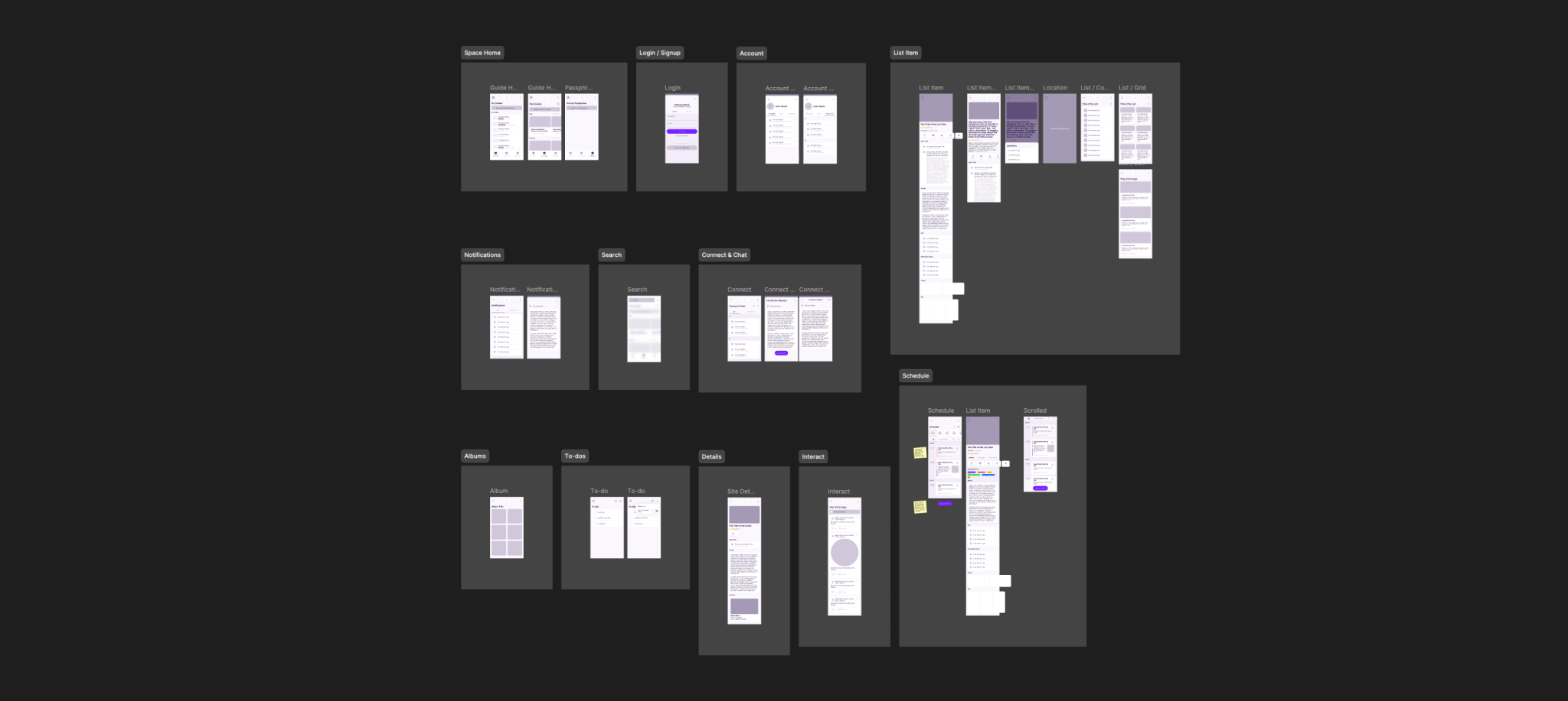
I stopped the production of high-fidelity mockups and built "Bindery"—a design system modeled after a manufacturing assembly line. We shifted our focus from vanity pixels to high-velocity delivery.
- 40% reduction in cycle time. By moving from "bespoke" to "standardized," we cleared the bottleneck and allowed the team to actually hit their roadmap targets for the first time in months.
- 3.3 FTE annual savings. We recaptured the equivalent of over three full-time engineers' worth of time by eliminating the constant back-and-forth over UI bugs and custom front-end builds.
- Launching a new revenue stream. This newfound efficiency didn't just save time; it allowed us to build and launch an entire Ticketing platform from scratch on a timeline that would have been impossible under the old system.
"We didn't need a 'pretty' design system; we needed a manufacturing system that prioritized speed over vanity."
A broken assembly line
The deepest frustration was that our designers and engineers were speaking two different languages. A designer would hand over a beautiful image, and the engineer would spend half their day trying to figure out how to make a web button look exactly like a native iOS button.
It was a massive waste of talent. Our software was meant to disappear into our clients' branding anyway—so why were we obsessing over custom UI elements that our customers were just going to override with their own logos and colors? I realized that my job wasn't to give the engineers more "guidelines"; it was to give them standardized parts.
Building the "Bindery" engine
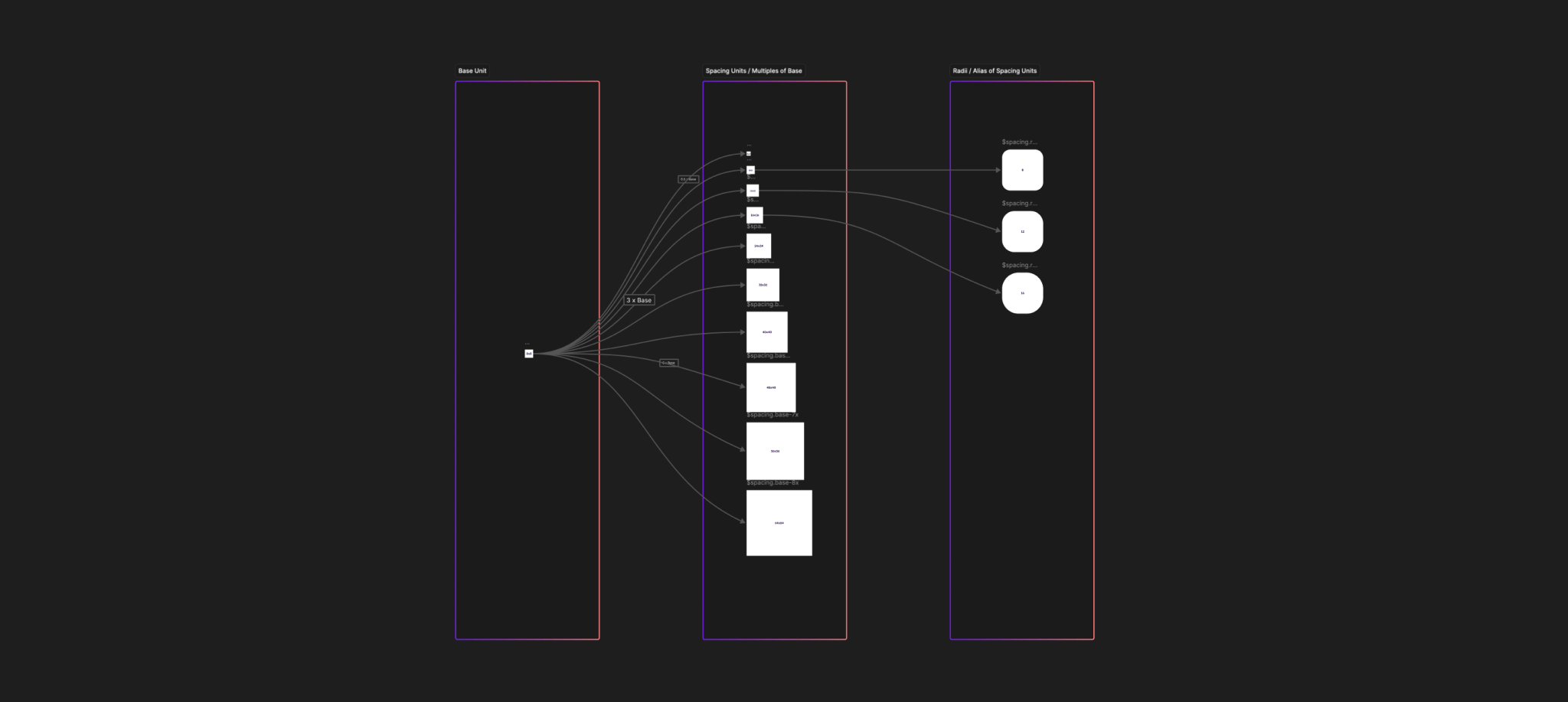
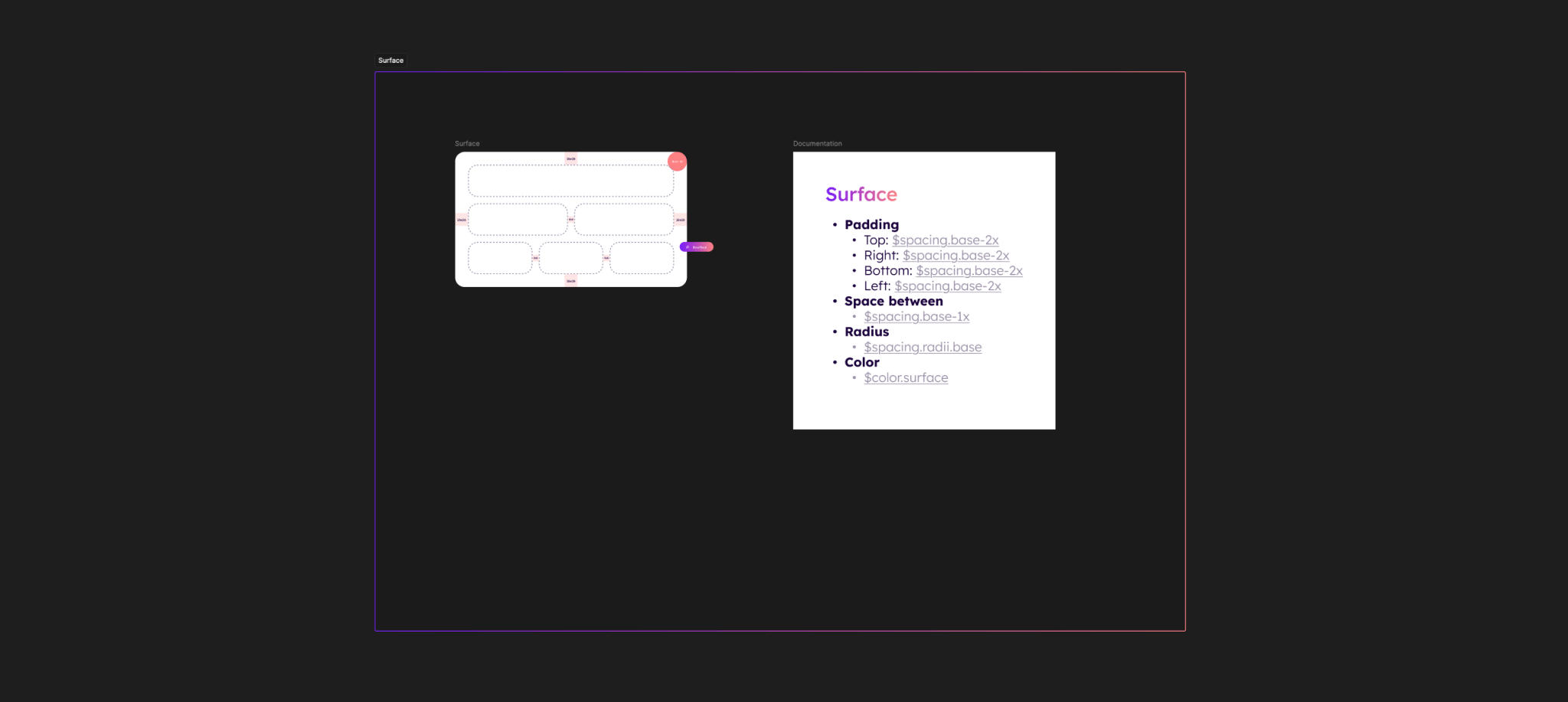
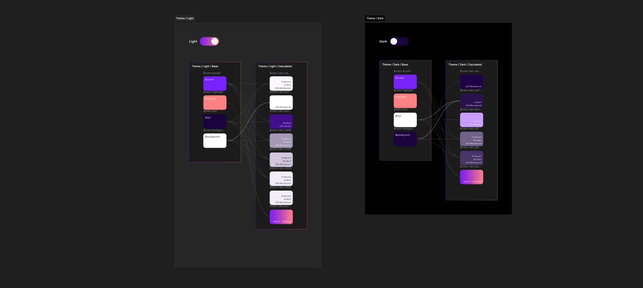
I architected Bindery on a "wireframe-first" workflow. I essentially banned high-fidelity mocks for standard features. Instead, we provided clear, semantic wireframes that defined the logic and the user experience, then empowered the engineers to use their own native codebases to handle the "last mile" of UI.
We stopped dictating pixels and started defining behavior. Whether a user was on a web dashboard or a mobile app, the experience felt identical because the structure was standardized, even if the individual platforms handled the rendering differently. It turned our design process into an API-first conversation rather than an art critique.
"It turned our design process into an API-first conversation rather than an art critique."
Where I had to pivot
In the beginning, I tried to force a single "universal" design language on every platform. I wanted one set of components that worked exactly the same way on a 27-inch monitor and a 5-inch phone.
I quickly realized that users don't want "universal"—they want "familiar." An Android user expects an Android experience. By trying to be too rigid, I was actually making the product harder to use. I had to learn to let go of total visual control and trust the platform engineers to make the right calls for their specific hardware. I shifted Bindery from being a "rulebook" to being a "foundation," which is when the velocity truly took off.
What I'm still thinking about
Now that the "factory" is running smoothly, I’m looking at the next bottleneck: documentation. Even with a great system, new hires still spend a lot of time asking "where is the component for X?" I’m exploring ways to make the design system self-documenting, so the "manual" for the factory is built directly into the tools the engineers are already using every day.
"I had to learn that 'universal' design usually just means equally frustrating for everyone."